


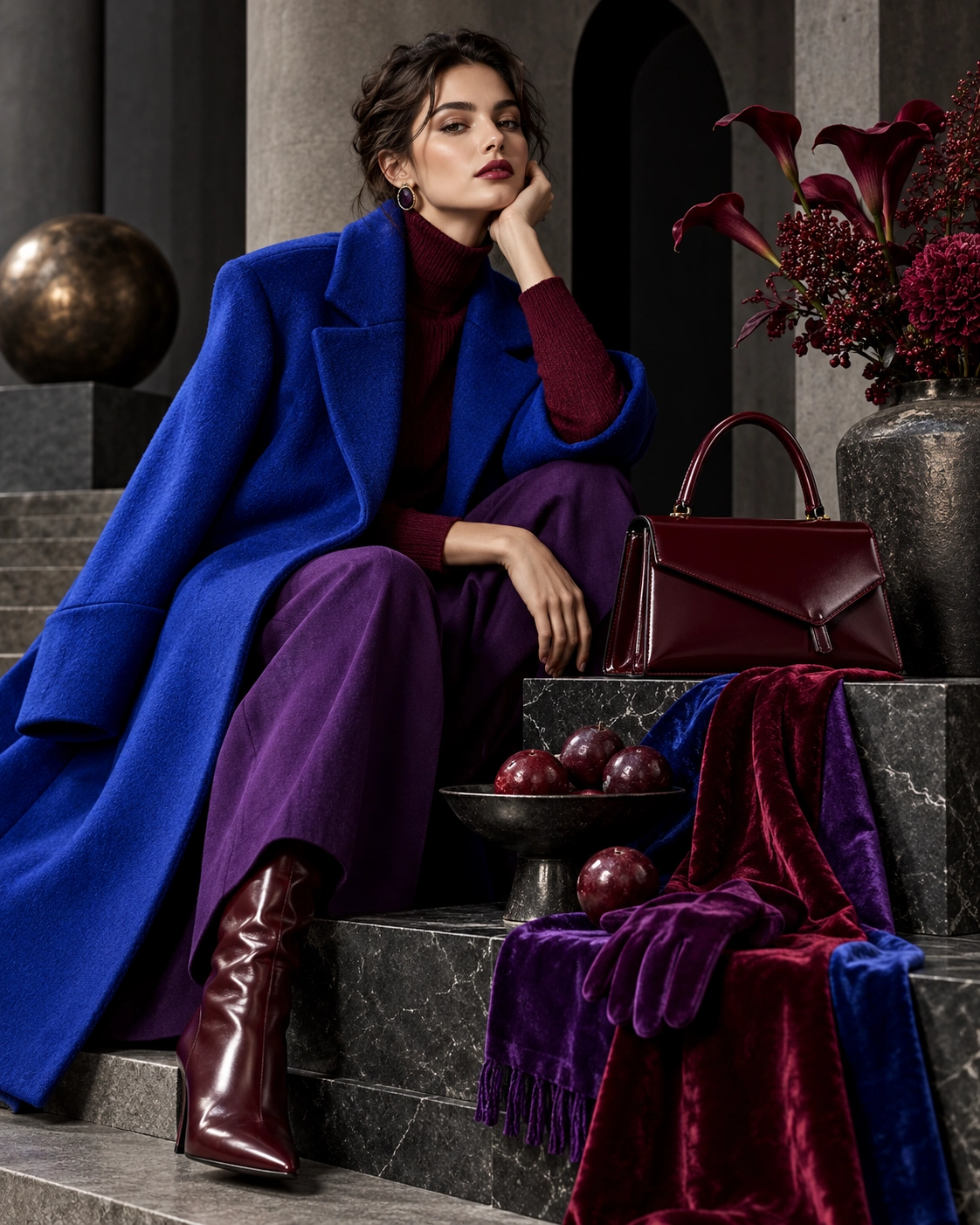
The habit of automatically associating autumn with beige, brown and grey is being challenged in 2026. Fall/Winter collections use electric blue, vivid red, royal purple, turquoise, peach and deep burgundy as full visual statements rather than minor accents. Color becomes the central idea of a look instead of a decorative afterthought.
The refined quality of this palette is that bright color does not have to look youthful or sporty. A cobalt coat, plum velvet dress, burgundy bag or purple cashmere sweater can feel remarkably adult when built on classic forms. What moves color beyond trend is the calm contrast created by good material, precise cut and restraint elsewhere.
The same shades echo through beauty and interiors. Burgundy lips, plum nails, dark-blue liner or one turquoise object can create the same emotional climate as the wardrobe. Color therefore becomes more than something we wear; it becomes a small environmental tool for adjusting the mood of autumn.
Color in autumn is not merely decorative; saturated tones create stronger contrast against darker seasonal backgrounds and sharpen the silhouette. Burgundy and purple add depth, while electric blue and cobalt carry a more graphic energy. Repeating the same palette in accessories, makeup or interiors can create cohesion without making the season feel visually heavy.